Morpak Industrial Packaging branding and website
Morpak has been providing high-quality industrial packaging solutions for almost 40 years. They are specialists in packaging, services, and logistics. Stoere Binken Design created the complete rebranding, from the logo to the fleet vehicles and bespoke Morpak website. A clean, masculine corporate identity with muscles and guts. A project for a very nice Limburg customer that we have enjoyed working on.

Director Dimitri Romeijnders has taken over the family business from his father and he has many plans and clear ambition. His challenge to Stoere Binken Design; respectfully refresh the Morpak Packaging Solutions branding and put the new brand firmly on the map. We have ambitious plans for the future.
Our solution starts with a powerful rebranding. A corporate identity with muscles in a predominantly masculine world. A strong visual language that stands out for its color and lines. Company vehicles that you cannot overlook. Our designs and concepts for Morpak are distinctive, visually very powerful, and have prepared the brand identity for the future.
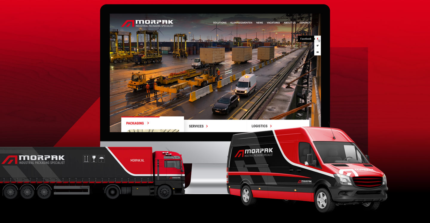
Morpak website with muscles
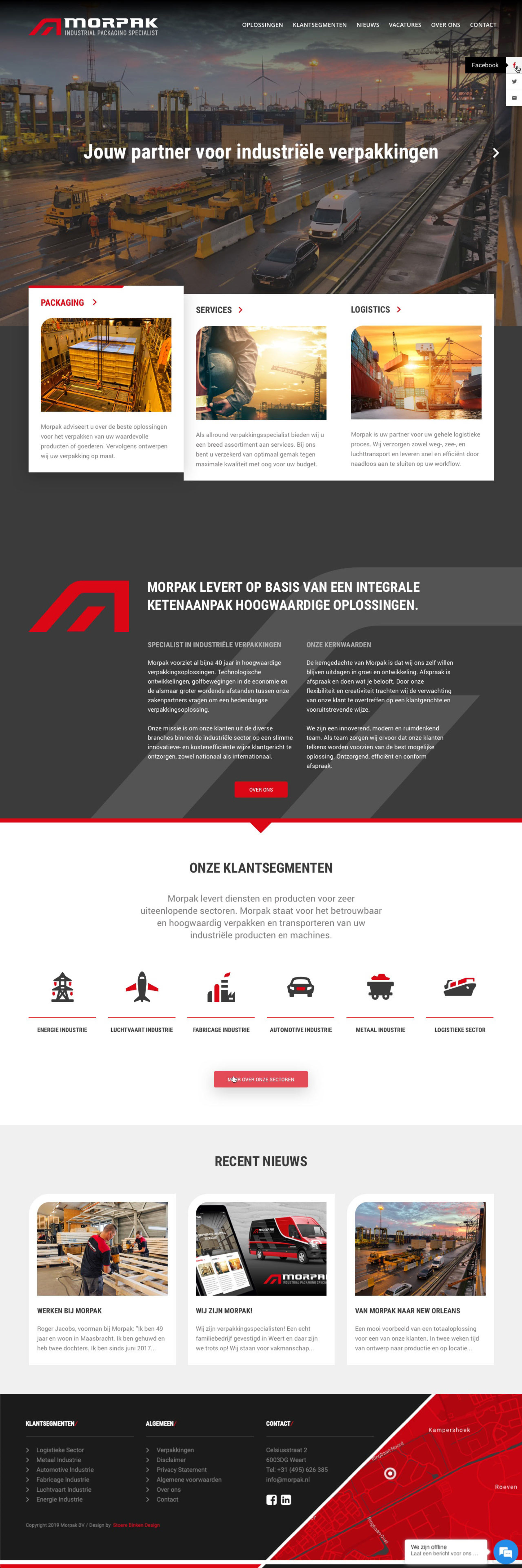
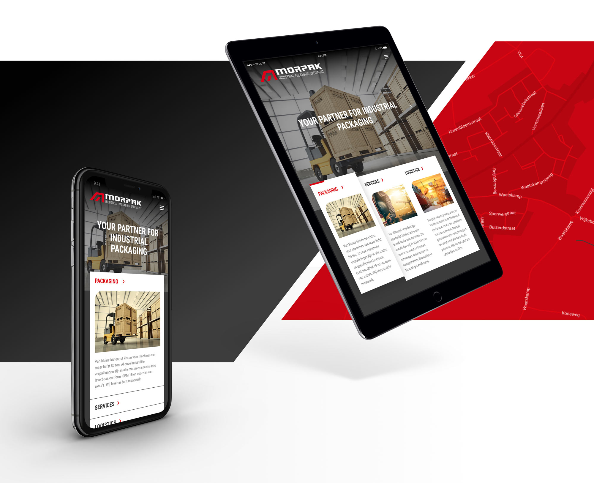
The website is logically divided into the 3 Solutions that Morpak Industrial Packaging Specialist offers; Packaging, Services, Logistics. Large clear banner photos give the website power and excitement. The super menus bring you to the right pages quickly. The red-black color combination is striking for the industry in which Morpak operates. We use these signal colors as effectively as possible in web design. And the round corners of the web design elements match the character of the logo.
We gave the 6 client-segments their own information icon, so you can quickly identify them. These icons are used across the complete corporate identity as well. Web design Limburg at its best.
Web design
Morpak BV is a family business with 40 years of experience
Morpak is specialized in making wooden crates, crates, and special pallets for machines and industrial products. Their professionals can work for customers both in their own production plant and on location. With almost forty years of experience, 40 employees, and 10,000 square meters of the production facility and office space, Morpak can surely call itself a packaging specialist.
Morpak recently acquired Van Veghel, the packaging specialist from Eindhoven.
Damn, that's awesome!
We have commissioned Stoere Binken to develop and shape Morpak’s new identity, which has led to a bad-ass identity. The new brand identity, the new graphic design, the new website and the design of the social media channels contribute to the further development of our strategy.
Owner Morpak BV
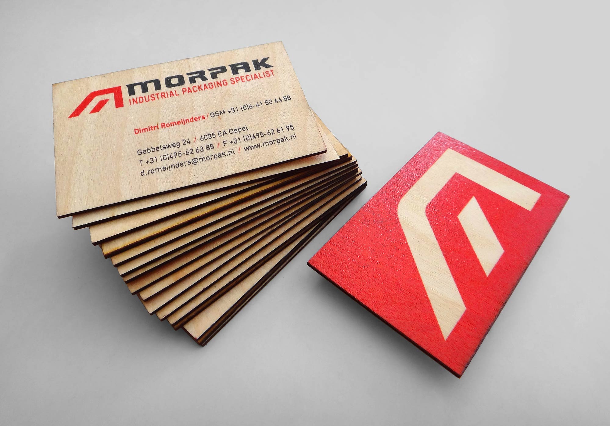
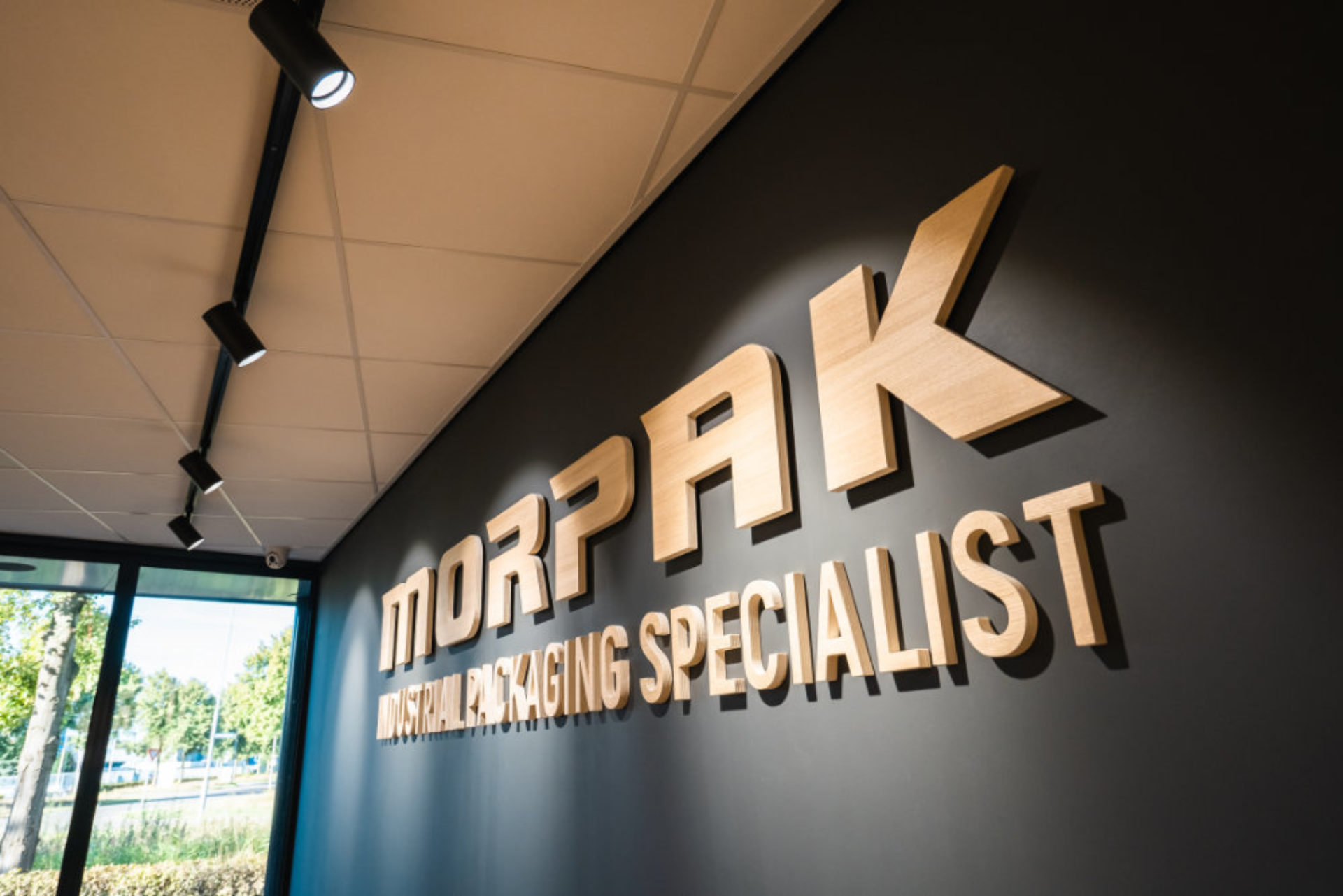
Wooden business cards
If wood is the basic material with which you work and in which you pack almost all of your products, then it is an integral part of your brand identity. We have therefore made wooden business cards for Morpak. Customers love this corporate identity “special product” and it leaves a lasting impression of Morpak.
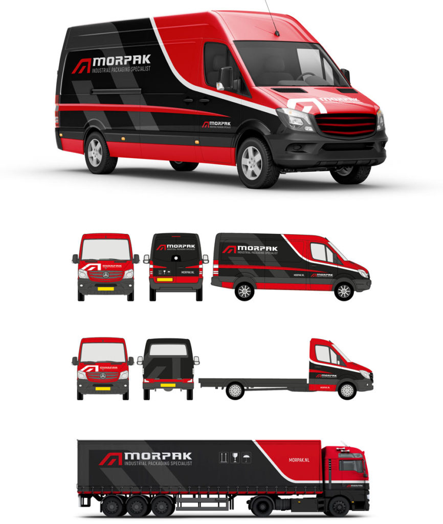
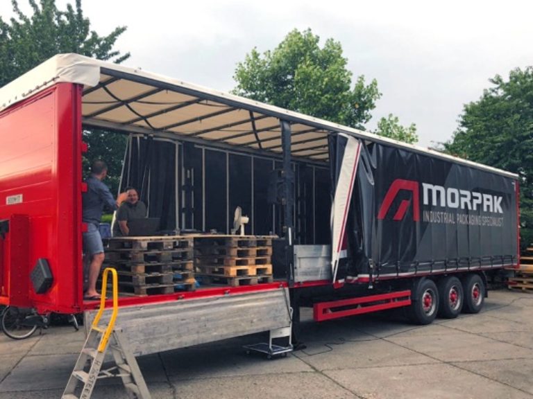
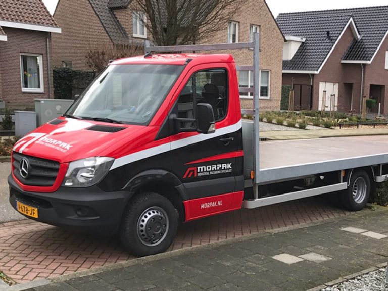
Vehicles are mobile business cards
The Morpak fleet vehicles can be seen on the road every day. The most motivated employees are behind the wheel. They bring and collect Morpak’s products and transport them throughout Europe. We are convinced that Morpak’s vehicles are, apart from their responsive website, one of the most visible and tangible brand expressions.
If you see one of the Morpak vehicles on the road, give the driver a thumbs up. They do their work with passion and extreme precision. Respect!
Copyright interior photos in the gallery below Prolight Weert.
More vehicles
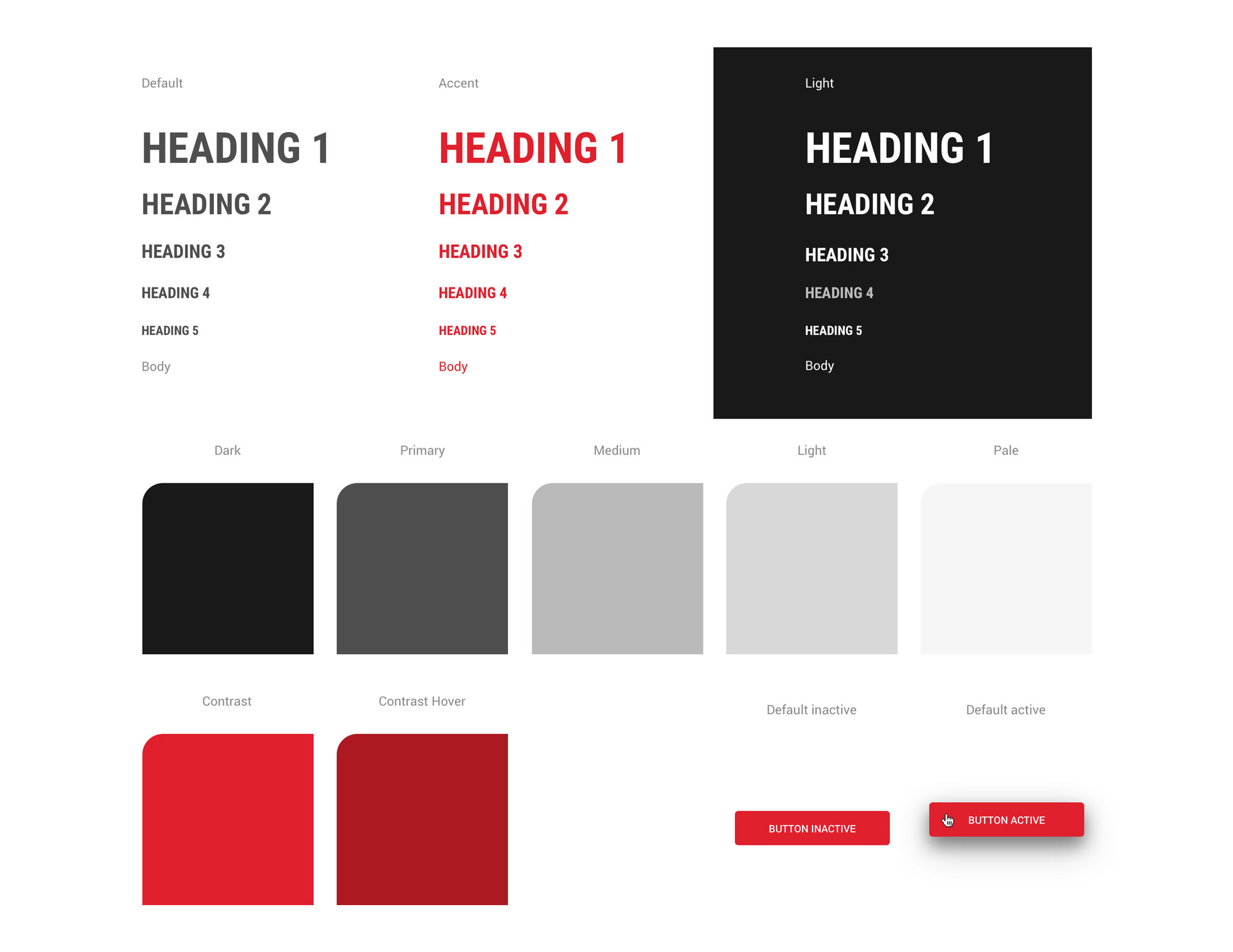
A design system ensures brand consistency
A ‘design system’ is a collection of reusable corporate identity components, summarized, and clearly documented. This enables those involved to create different and uniform brand expressions, independently of each other.
At Stoere Binken Design we always develop an internal design system because we think brand management is important. With this we document the DNA of your company, we ensure that new brand expressions meet the brand design guidelines and we can work more efficiently.
Below you can see an excerpt from the ‘Webdesign’ section from the Morpak website design system.
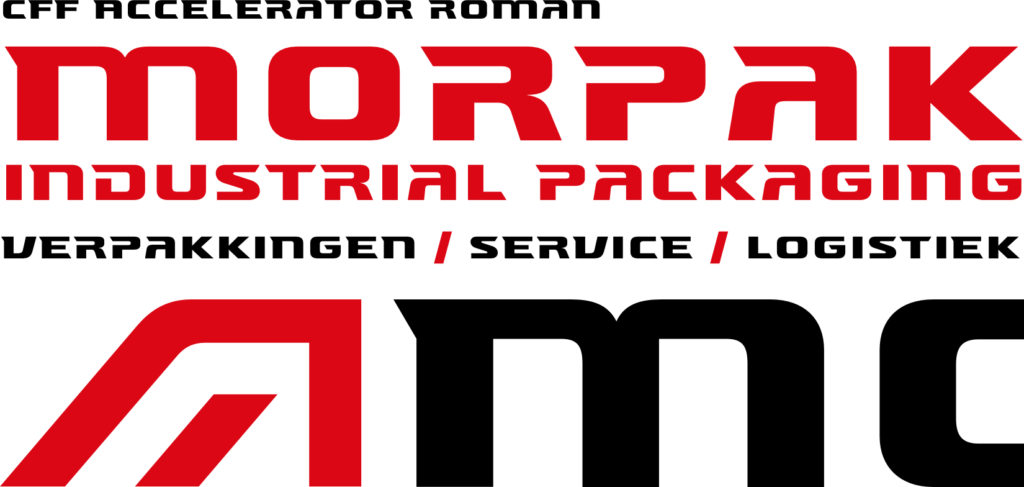
Custom logo font Accelerator Roman
The logo font used is CFF Accelerator from creative director René Verkaart. Under his alias Characters Font Foundry, he designs custom font solutions for companies and designers around the globe.
CFF Accelerator Roman
CFF Accelerator has always been exclusively an italic font, but we have made a special Roman (upright) version for the Morpak corporate identity. We have completely revised the font, glyph by glyph, and expanded the font family with a Roman version that is now also officially available through Characters Font Foundry.
Custom type